Branding & Website for SpaceArchitects
A brutally simple brand for seriously complex work.
Branding
Space Architects is a software engineering studio specializing in the kind of architecture problems that get seriously complex, seriously quickly.
Mirroring their approach to problem-solving, we built Space Architects on strong foundations first. Structure is their bread and butter, so naturally, it became ours too. Brutalist typography, bold geometric shapes and a rigorous grid laid the groundwork.
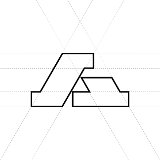

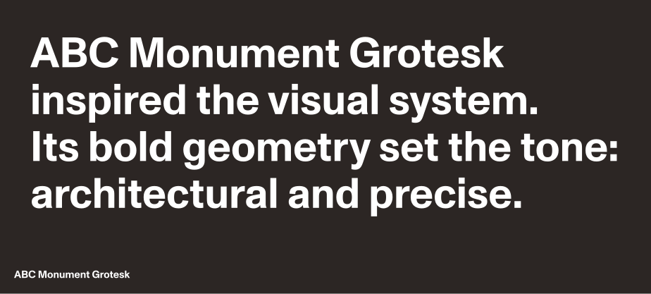
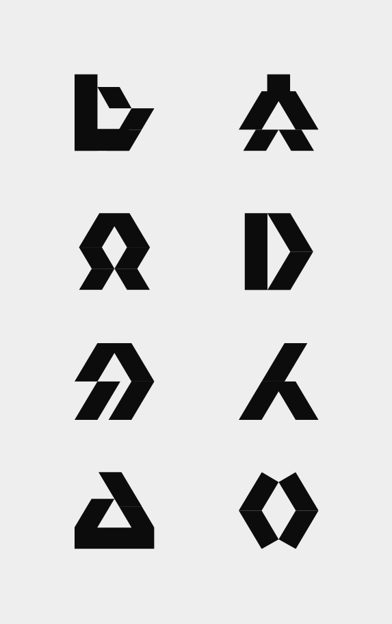
Type & ShapesType, language and simple shapes carry the identity, with the logo reducing brutalist simplicity to its core.
With the foundational work ticked off, we injected the identity with moments of delight. Bold color, graphic patterns, custom iconography and playful interactions add personality. Precise shouldn't be cold.



It all comes to life on the website, where columns set the structure and interactions bring the play. Grid, motion and content work together to turn the identity into a digital experience that's equal parts structured and enjoyable.
The result is an identity that proves technical expertise doesn't have to hide behind convention.
- Brand & Website Design
- Ariana Montero
- Logo
- Semir Greven
- Creative Direction
- Julian Bauer
- Messaging & Copy
- Tammo Mamedi
More branding cases