Branding for Ravion
From the ground up, Ravion was built to flex beyond convention while maintaining control where it matters.
W22 (Flightcontrol)
Devtools
Ohio/Toronto
Ravion is a YC-backed cloud infrastructure company bringing IaC, deployments, CI/CD and observability together in one place.
When Ravion came to us, they were deliberate about creating a brand that challenged industry norms. A feat we would gladly take on.
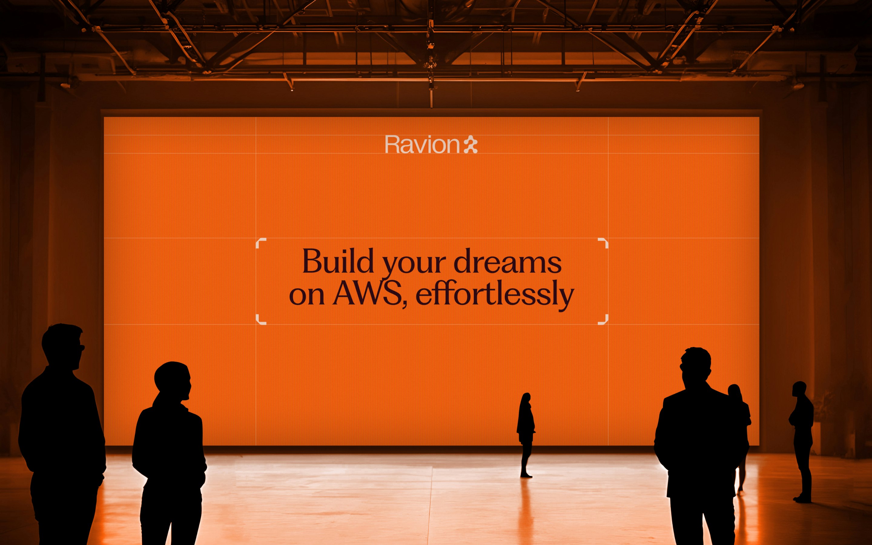
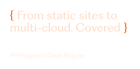
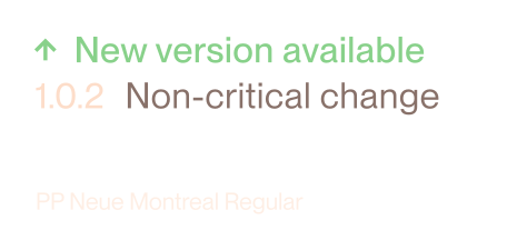
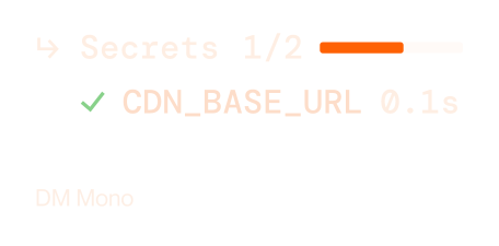
TypographyCharacter where it counts, clarity everywhere else. PP Fragment Glare leads, PP Neue Montreal keeps things functional and DM Mono brings technical precision.
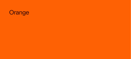
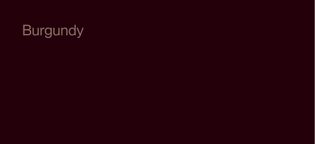
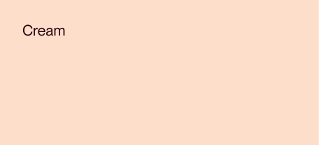
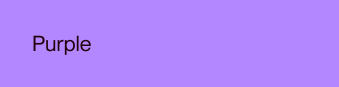
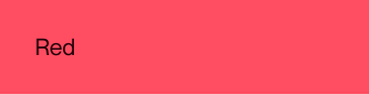
ColorOrange, burgundy and cream form the brand's primary palette, already pushing Ravion away from the sterile conventions of enterprise infrastructure software. Purple, green, red and yellow add accents and draw attention where needed.


Starting with the logo, we wanted something that combined momentum, stability and flexibility. Essentially, everything that makes Ravion, Ravion.
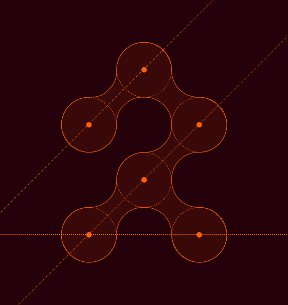
The overarching direction called for originality and out-of-the-box thinking but we still had a demanding cohort to design for: DevOps teams. Given how they navigate complexity, identify patterns and organize information, we grounded the brand in how they actually work.
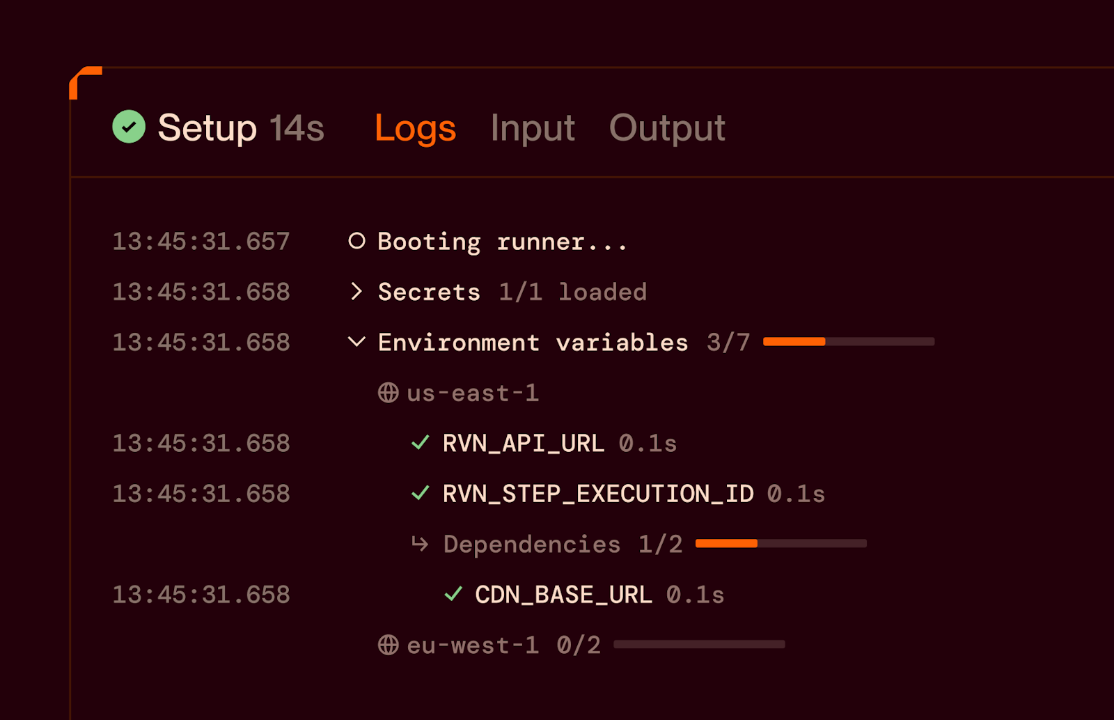

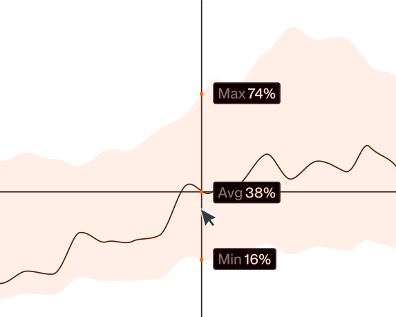
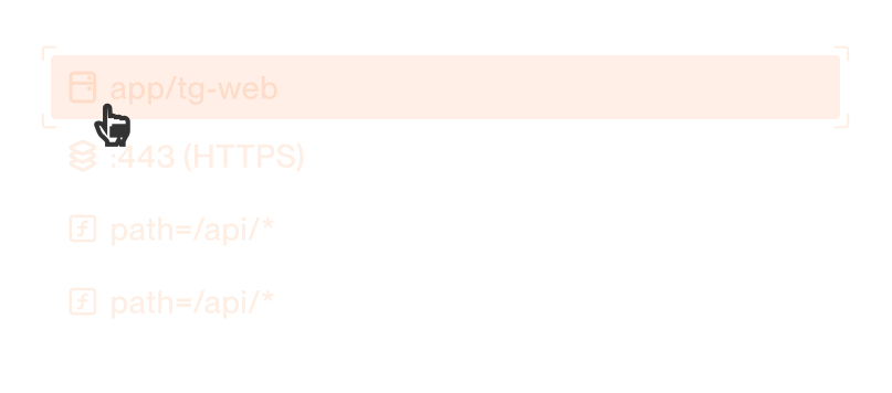
At its core, Ravion was all about control. From the smallest brand elements to the most intricate interactions, hierarchy, structure and motion were designed so users could clearly navigate the platform, with as many levers and as much control as possible.
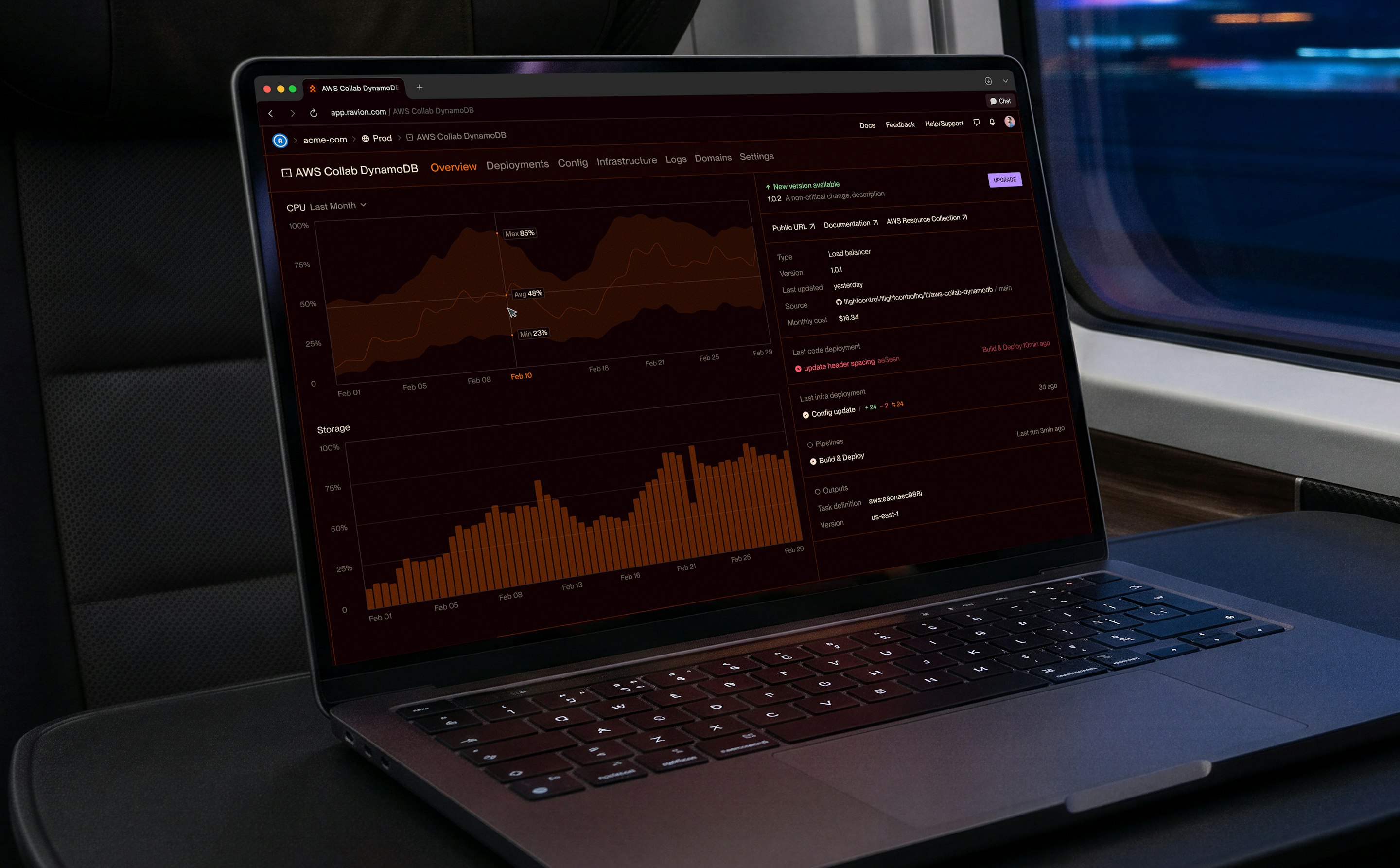
Product UIProbably the biggest challenge with this brand: How themed can an interface get while staying usable?
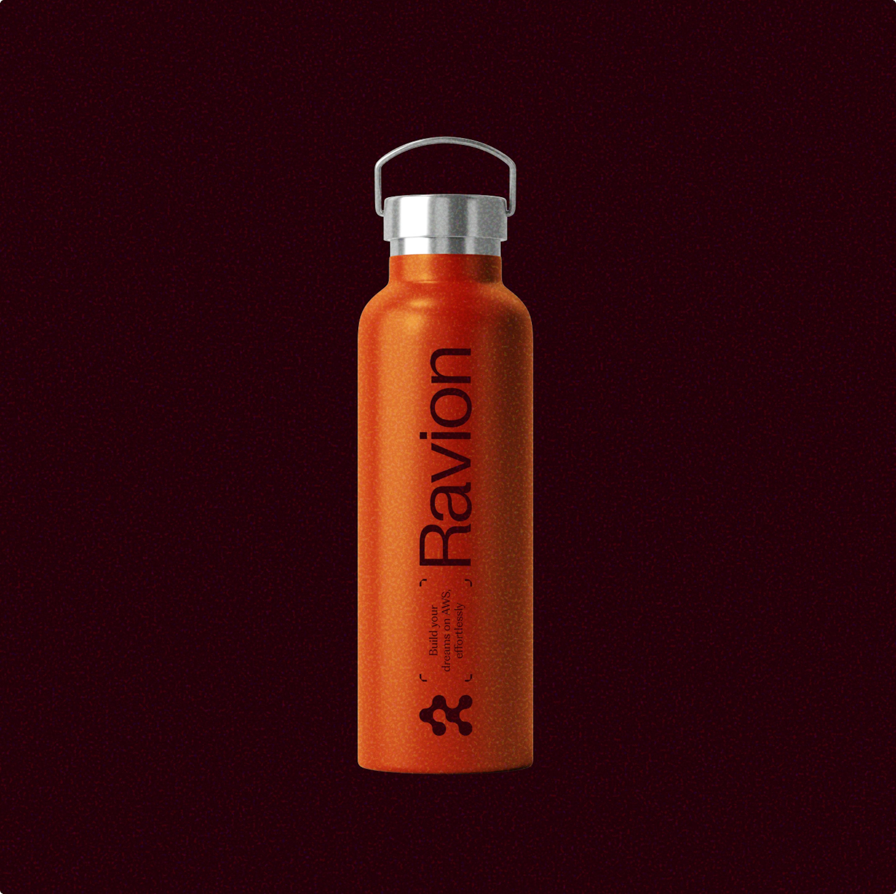
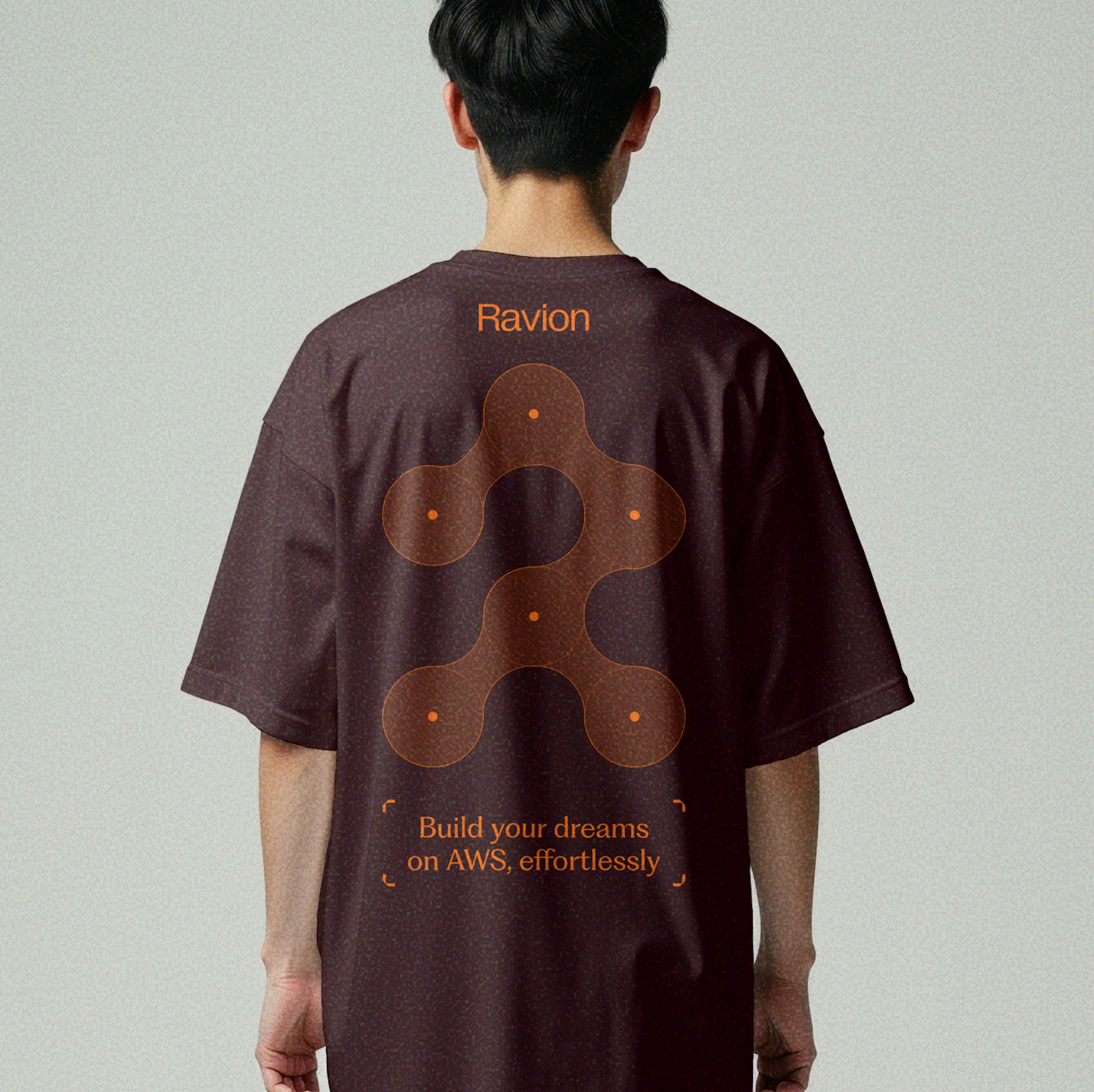
Ravion looks like nothing else in its field while delivering what matters most: brand recognition, functional design and control where users need it.
- Brand Strategy
- Tammo Mamedi
- Creative Direction
- Julian Bauer
- Creative Concept
- Shura Gerasymenko
- Visual Identity
- Shura Gerasymenko
- PM & Ops
- Anastasiia Bezhevets
Ravion x Overnice
Ravion marked a new chapter in a partnership that started years earlier with Flightcontrol. We stayed on for the pivot, shaping the new brand and product from their earliest stages.
More from Ravion
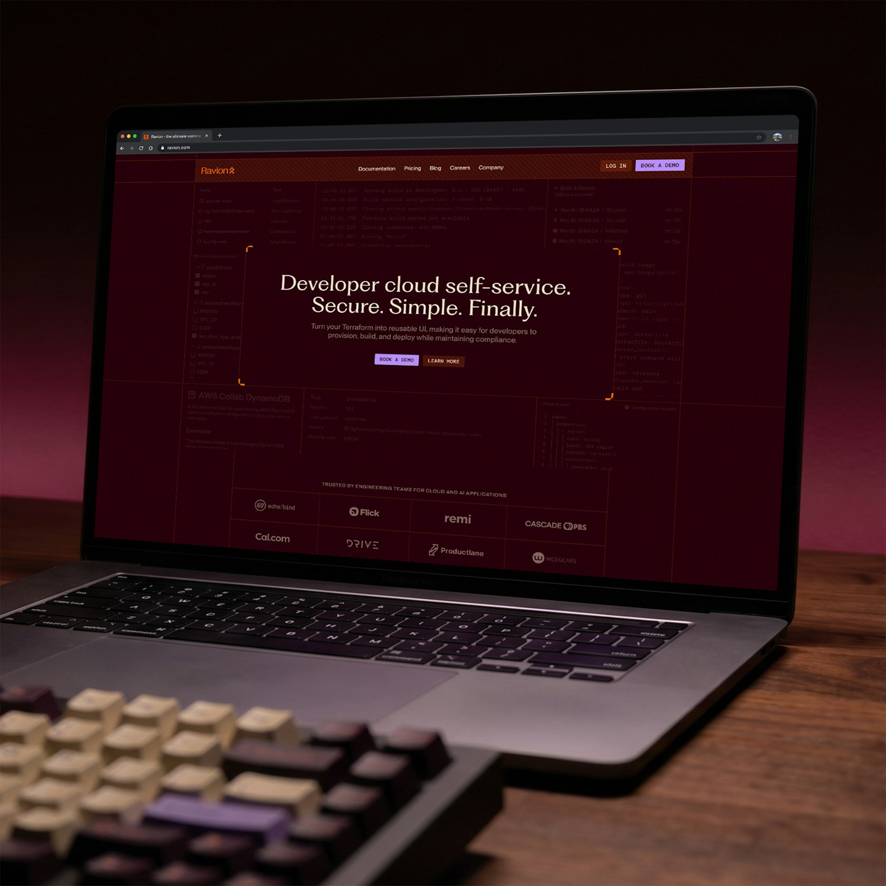
We turned Flightcontrol into Ravion, starting with a complete Rebrand(Just seen) and a new Website to match.
More branding cases